Buhay: Uncovering the Philippines’ Rich Culture
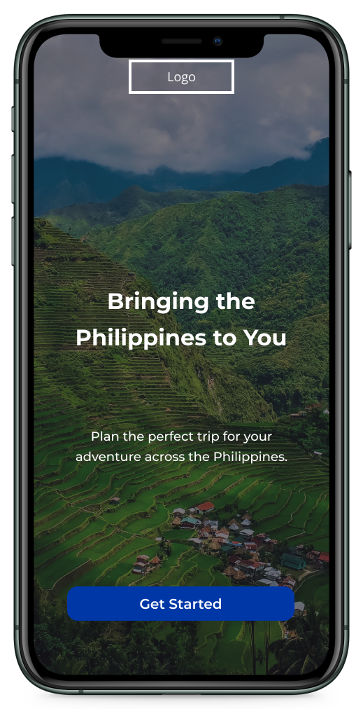
Designing a travel app that shows the different attractions of the Philippines
Figma, Maze.co
Tools
Role
UX/UI Designer
Overview
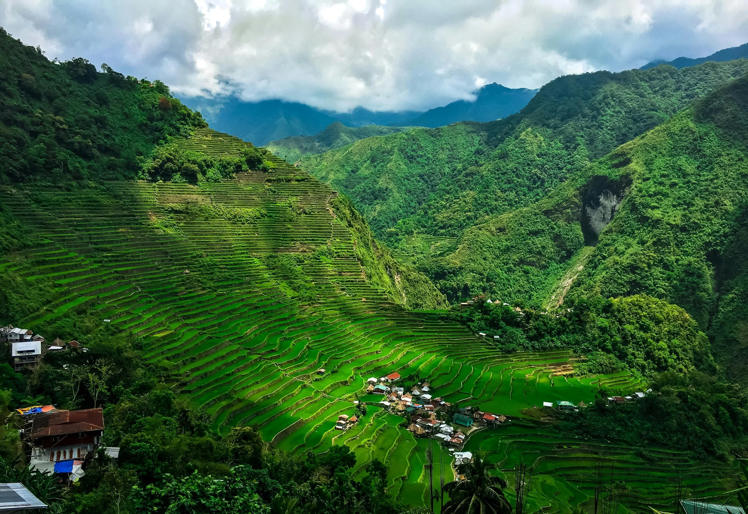
The Philippines is a country comprising over 7,000 islands and within those islands, many different cultures, groups of people and attractions exist. The country is a popular travel destination for many people around the world, and even the locals try to travel across the country. However, the majority of people only go to the most popular places such as Palawan or Boracay, even though there is a lot more to see within the country. I wanted to use this opportunity to try and find a way to embody what the Philippines has to offer.
Problem
The Philippines’ culture and attractions are vibrant, but travellers only go to the most popular areas of the country. Many travel apps fail to capture the full depth of the Philippines' vibrant culture.
Solution
Design an end-to-end travel app that highlights the rich culture and attractions of the Philippines by creating a travel planner that includes all the necessary information needed to inspire and encourage travellers from all across the world. This would mean understanding what travel is like in the Philippines, as well as understanding travellers and what they look for when they plan for trips.
Understanding Travelers
Since I was diving into the travel industry, I needed to understand the users and the businesses a part of the travel industry. For this project, I applied two research methods; User Interviews and Competitive Analysis.
User Interview Main Takeaways
For the user interviews, I asked two sets of questions; the first set was about travel in general, and the other set was about travel specifically in the Philippines. I organised and structured these answers into an affinity map, summarised below:
Weather in the Philippines
Travelling can be a frustrating experience because of the monsoon/typhoon season that occurs in the Philippines. And when it doesn’t rain the weather can be really hot and humid. Travellers would have to plan accordingly.
Important Features for a Travel Digital Product
Participants listed a number of things they thought were important to see on a travel app or website such as reviews, weather, price, deals, description of the place's opening hours, services offered, location, modes of transportation, and food.
Accommodation
When it comes to accommodations, participants varied in priorities. Some participants prioritised comfort and relaxation, while others prioritised stimulating new experiences.
Finding Travel Information Online
There are a number of resources participants use to find information on destinations and activities such as Google, Agoda, Trip Advisor, Airbnb, YouTube, content creators, and other social media like TikTok.
Essentials of Travelling
The participants had different travel essential lists from one another. One participant said having an emergency travel bag with essentials such as his multi-tool, shoes, sunglasses, and portable shower was a must. Another participant said having a UNESCO heritage site when planning her travels was a learning opportunity for her daughter. Other participants had more straightforward answers like ID, money, Wi-Fi, phone, food spots, accommodations, and hidden attractions.
Pros Travelling in the Philippines
The Philippines is a popular tourist destination and has a variety of things to do. There are a lot of sightseeing attractions and the cuisine is good. Furthermore, participants thought it was relatively cheap (at least for foreigners) to be able to travel to the Philippines. There are plenty of things to enjoy for everyone.
Cons Travelling in the Philippines
The transportation system is bad, especially if you are not used to it, and the toll gates can get expensive. Furthermore, some participants have mentioned that there can be hidden prices that aren’t always mentioned on the website of an attraction or accommodation. One participant also mentioned how the Philippines are made of many different islands but the poor infrastructure and transport system does not allow the pleasure or appreciation of travel in the Philippines.
Competitive Analysis
Wanderlog
Pros
Organizes the necessary information for users to plan their itineraries accordingly.
Cons
The UI of the app is full of clutter and using Wanderlog would be better on browser.
RoadTrippers
Pros
Users can put in their start and end locations and will share information on everything you can do on that trip.
Cons
If users pay for pro, users pay for a yearly subscription and not for the one trip; pro is more geared for frequent travelers.
Sygic Travel
Pros
Shows descriptions and images of the places that users would like to see which makes it easy to quickly read through the view the places they’re interested in.
Cons
It is hard for users to find the information that they need or it is not available to them which makes it frustrating.
Hopper
Pros
It predicts airfares up to one year in advance and it is 95% accurate.
Cons
It does not cover all airlines and is limited to certain airlines.
Other UX Design Documentation
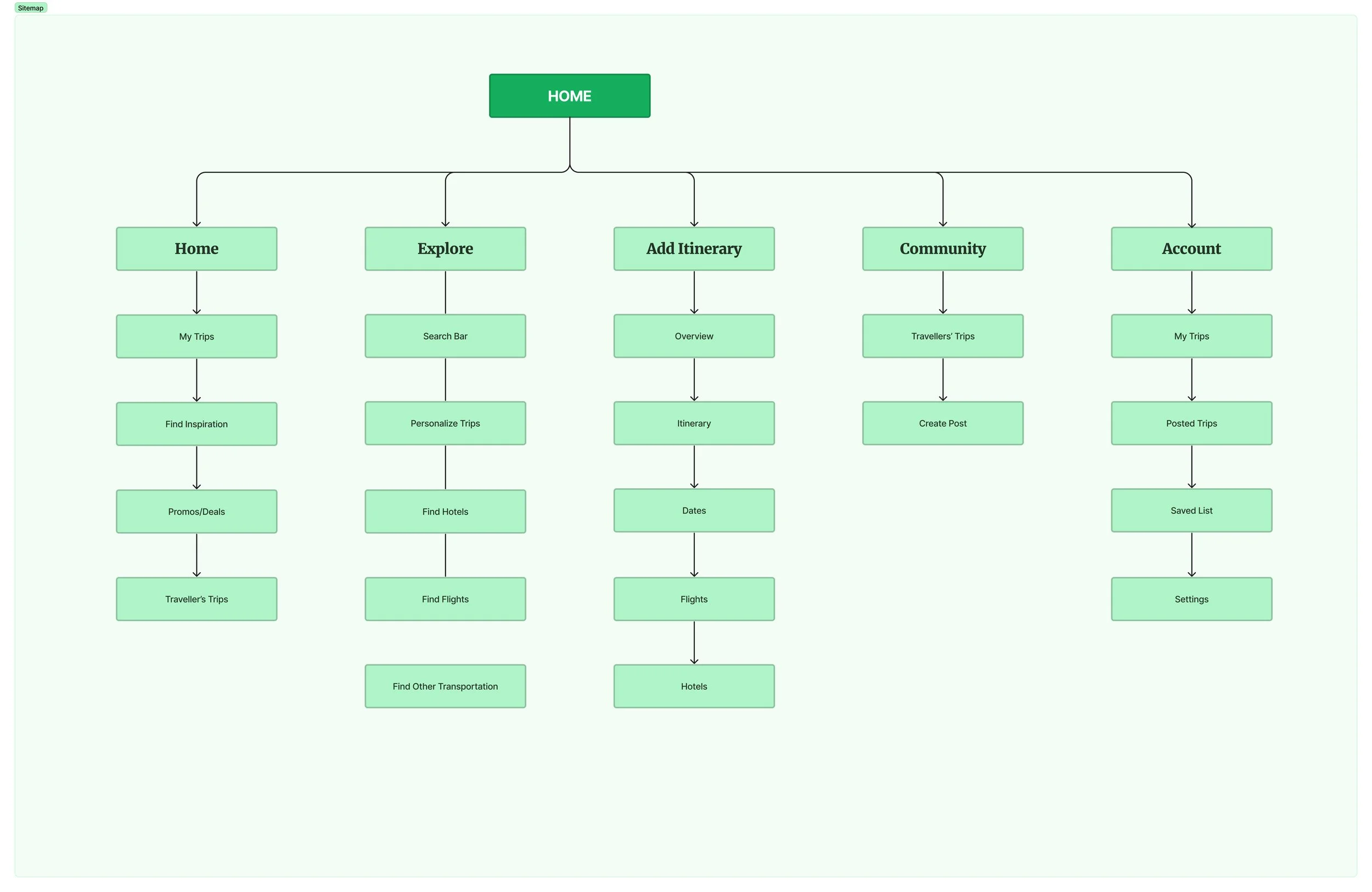
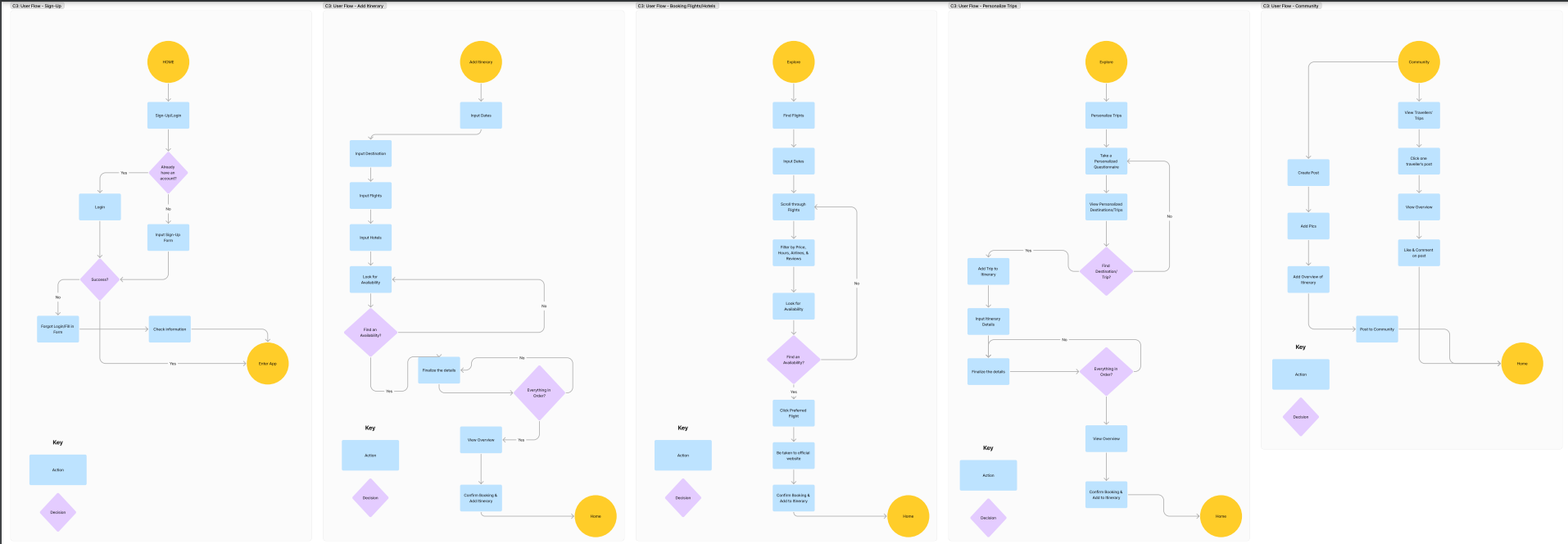
Based on my research, I organised and structured the content into a feature roadmap, sitemap, and user flows, which can be viewed in detail below.
Feature Roadmap
A list of features that I looked into and considered for the Buhay Project.
Sitemap
A hierarchical overview of the app’s navigation.
User Flows
A overview of steps users will take to accomplish a task flow.
“It is important to educate yourself and learn about the cultural norms so tourists don’t fall into the trap of misunderstanding.”
— Quote from Sheila, a participant from the user interviews
Designing To Meet the Users’ Needs
One of the main things that was important for this travel app was for users to be able to plan their trips. Travelling requires a lot of planning, documentation, money, and time and I wanted an app that felt convenient for those travelling to the Philippines. I also wanted it to be an app that also highlighted the different attractions of the country, so there was a lot of features and components I had to consider when designing the app.
Creating an Account
In order to bring in user engagement and have users save their trips, I added the feature of creating an account.
‘My Trip’ Overview
The main feature of this travel app was for users to be able to plan out their trips. I designed the home screen to have the user’s created trips to be the first thing they see, making it accessible for the users.
Attraction Overview
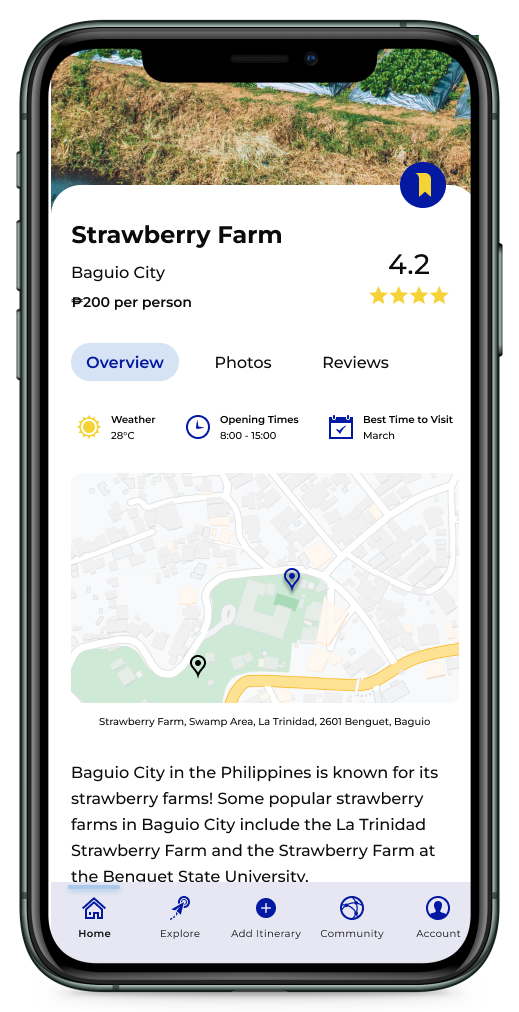
Another feature of this travel app was for users to be able to view and explore different attractions. This allowed the users to be able to view different attractions and activities they may be interested in and potentially adding it to their created trip. This feature would also bring in user engagement and users wouldn’t have to rely too much on multiple platforms or websites to view attractions.
Flights and Accommodations
Users won’t only be able to view different attractions, they would also be able to search for different flights and accommodations, making it more accessible for users to search and add onto their created trips. This goal of the travel app wasn’t just to allow users to plan out trips but to also have the necessary travel information one click away.
Community
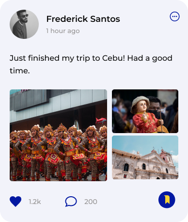
Sometimes it can be quite overwhelming to start planning out trips, especially with a number of websites and people recommending so many different attractions. Using what I gathered from the user interviews, a community screen was a great way for users to get insight and feel inspired on what other users were up to. This feature allows users to view and interact with each other’s travel posts, as well as make their own.
Component Library
With the mid-fidelity wireframes done, I had a visual idea of what the travel app was going to look like, which meant it was time to start creating the components.
Testing the Design
The main goals for the usability testing were to evaluate whether the overall user experience was smooth, identify the strengths and pain points along the way, and assess the user engagement. The participants liked the idea of having an app that showcased what the Philippines had to offer and thought the design represented that well. However, there were minor details that were missing that the participants wanted to be visible, especially for a travel app.
Iteration #1: More Visual Details
Participants wanted there to be more information that was visible and easy to spot. They believed that there was some information that was missing for them to know more about the attraction, although were unsure of what kind of information. To solve this problem, I added quick information such as the weather, opening times, the best time to visit, and of course, the map of the location. Participants also wanted to see the average star rating on the main attraction overview, rather than under the reviews tab.
Before
After
Iteration #2: Location on the Community Posts
The next iteration was a minor fix, where participants wanted the location to be shown on the post to show where other users have specifically gone.
Before
After
Iteration #3: Communication Error and Placement
The last iteration was for the Account screen, where participants had pointed out two issues. The first issue was the language of one of the buttons. The ‘Bookings’ button was a section for users to see the previous payments that they had made on the app. However, some participants believed that was confusing since the ‘Itinerary Overview’ screen had its own ‘Bookings’ tab which would show the flights and accommodations of that specific trip. Having a bookings section on two different flows that showed two different things only confused the user, so it was better to reword the button to ‘Reservations & Payments’ instead.
Before
After
The last change was the ‘Share Profile’ button, where one of the participants said to move that action to the ‘More Account Options’ button at the top right of the screen since the button does not fit right with the other sections on the page and it would just make sense to move it.
Closing Thoughts
I enjoyed this project a lot as it was a chance to learn more about my own country and try to come up with ideas to showcase the culture of my own home. It was also a chance to dip my toes in the travel industry and understand what makes their UI so successful since a lot of UX/UI designers love to take inspiration from them. The most challenging part of this project was probably the colour palette and the overall branding of the app. I went through multiple changes before finally picking the final brand style. If I was given the chance, I’d would probably work more on the brand style tile and draw inspiration from more examples. Overall, I enjoyed the demanding challenge of designing an app that specifically highlighted the beauty of the Philippines.
My Other Works
From Broken to a Working User-Friendly Website
Redesigning a small business’s website to be more efficient and bring in engagement from customers.
A Journey of Functionality and Visual Design
Redesigning Verso Books’ website to be more user friendly and functional.
Bringing Movie Lovers Together
Expanding Letterboxd’s reputation by adding a forum feature and a chat DM feature.


