Verso: A Journey of Functionality and Visual Design
Redesigning Verso’s website to be more user friendly.
Figma
Tools
Role
UI Designer
Overview
Verso Books is an independent radical publishing house that has taken pride in publishing critical works of non-fiction for 40 years. I wanted to use this opportunity to challenge myself and redesign their website to not only fit their brand and their content but also to be more user-friendly.
Problem
How can I elevate Verso’s website to improve user experience and usability?
Understanding Verso
Browsing Their Website
In my spare time, I like to indulge myself in video essays and read articles and blog posts on said essays. I came across a blog piece called ‘The Political Legacy of John Berger’s Art Criticism’ which was posted on Verso’s website. continued to browse the whole website and learnt that Verso was an independent publishing house that had books specifically on politics and also shared a blog.
I also noticed the UI of their website. I found their UI to be very interesting and quite easy to navigate but I also wanted to see whether there were other ways to elevate the user experience. So I took it upon myself to challenge myself and redesign Verso’s website. But how was I going to start?
Finding Inspiration
I learnt that Verso is an independent publishing house that offers a variety of books (specifically on world politics, issues, and culture), as well as articles and blog posts. With this in mind, there were multiple platforms that I looked into for inspiration.
The first website that I looked for was WHSmith. WHSmith is known for selling books and different stationery. They are also known for having shops located in airports and train stations, making them known and accessible to travellers around the world.
Since Verso Books are known for selling books on their platform, it was best to look into other bookstore platforms, like WHSmith. As I was navigating their platform, I felt inspired by certain areas and pages of their website.
The first was the books section. A lot of bookstore websites have the same sidebar/vertical bar, which I kept note of. I also found inspiration in their ‘About’ page and their ‘Authors’ page.
The second platform I found inspiration from was Fully Booked. Fully Booked is another bookstore that also sells stationary items.
I was very fond of their landing page and the vibrancy of their colour palette. I was inspired by how they section their categories and what they prioritise. I was also inspired by their ‘Featured Authors’ section, which showed 3 cards of 3 different authors, each of which you can click to view more.
The last inspiration that I looked into was Medium. Medium is a digital publishing platform where anyone can share their perspectives, knowledge, and wisdom with the world. The reason I picked Medium for inspiration was because the platform is known for posting articles and blog posts, something that Verso also does on its platform.
I wanted to look into how they lay out their articles and long paragraphs. As I browsed through, I noticed they used a lot of whitespace and focused a lot of the content in the middle of the page. They also kept 40 to 60 characters per line, making it easier for users to read through different articles/blogs.
Redesigning Verso
Wireframes
Creating a Good Impression with the ‘Home’ Page
Before
After
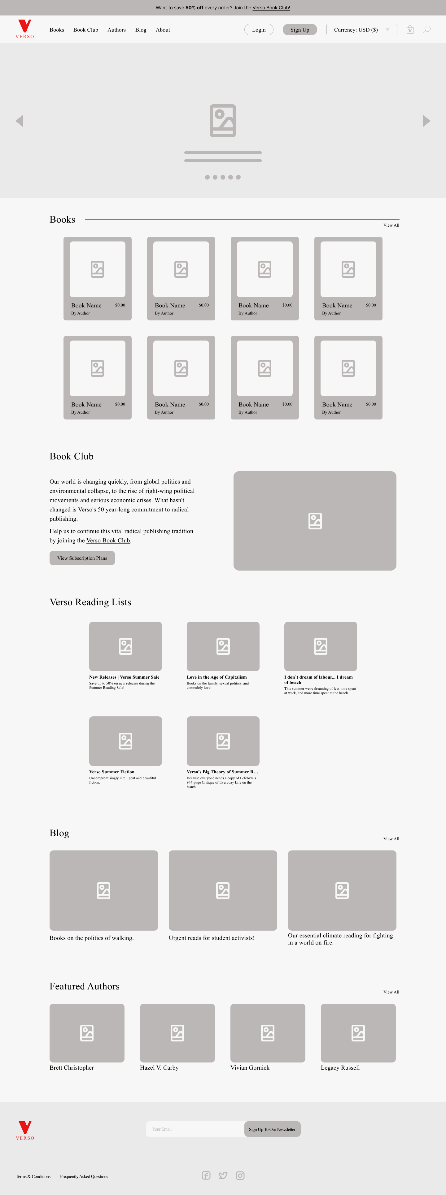
For the homepage, I first added a carousel for the hero section so it did not feel as overwhelming when users landed on the page.
Another change I made was the margin, which I made for all the redesigned pages. I wanted to bring the content closer together and more centred, making it easier for users to process the content shown to them.
One thing that users can also do on the website is sign up for their book club. Since this is a subscription-based feature, I wanted to highlight it more on the home page.
Next, I made the reading lists into their own cards, making them easier to spot and visualise. I also changed the name of the section ‘Authors’ to ‘Featured Authors’ to make it more inviting and indicate that there are other authors to check out on the site.
Lastly, I added a footer for all the pages, making it easier for users to spot important information like the newsletter, socials, terms & conditions, and FAQs.
Exploring the ‘Books’ Page
Before
After
The sections for the ‘Books’ page felt a bit overwhelming when and felt like the content was being squeezed together.
So for this page, I wanted to space out the content and put it in its own sections, making it easier for users to spot the information. It will also encourage more seamless scrolling since the information has been spaced out.
The last biggest change I made for this page was putting the genres as a sidebar instead of them being individual buttons. I wanted the user to easily read the genres by reading it as a list, downwards, instead of across the page. It also allows users to scroll through the books and genres simultaneously.
Decluttering the ‘Book Club’ Page
Before
After
When I went through Verso’s ‘Book Club’ page, I thought it was a bit of a clutter and was hard to understand what information I was looking at. Since this page is about Verso’s subscription plans, it is important to encourage users to subscribe and be able to spot important information like the price and what each subscription entails.
The first biggest change I made was I designed cards for each subscription plan. Verso already had its coordinated colour for each subscription, so I made sure to keep that when designing the cards. For these cards, I wanted the user to easily spot and distinguish each subscription, hopefully encouraging users to subscribe to their preferred plan.
The next big change I made was keeping the whole page plain white, and just sectioning each description of the plans with a title. I added the subscription plan card to the left of each section so the users understand which plan they are currently reading about and make it easy to just click.
‘Blog’, ‘Authors’, and ‘About’ Pages
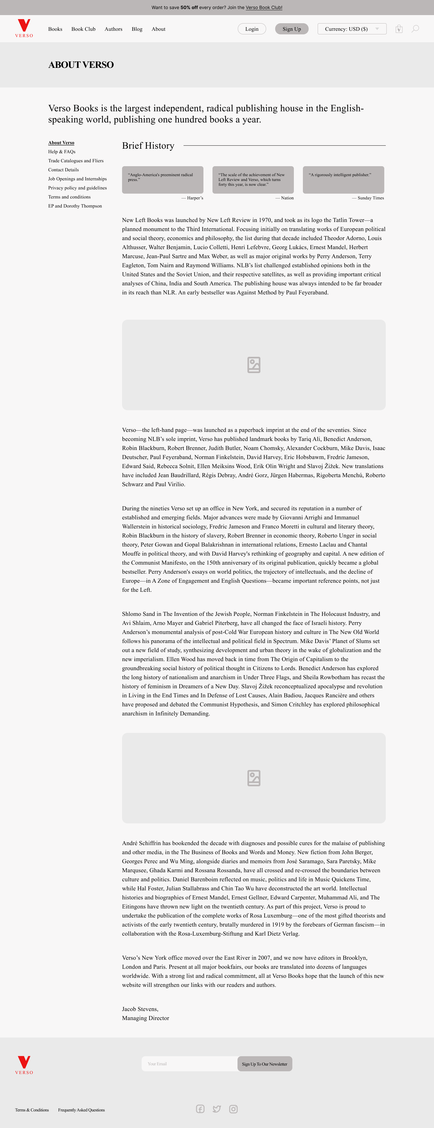
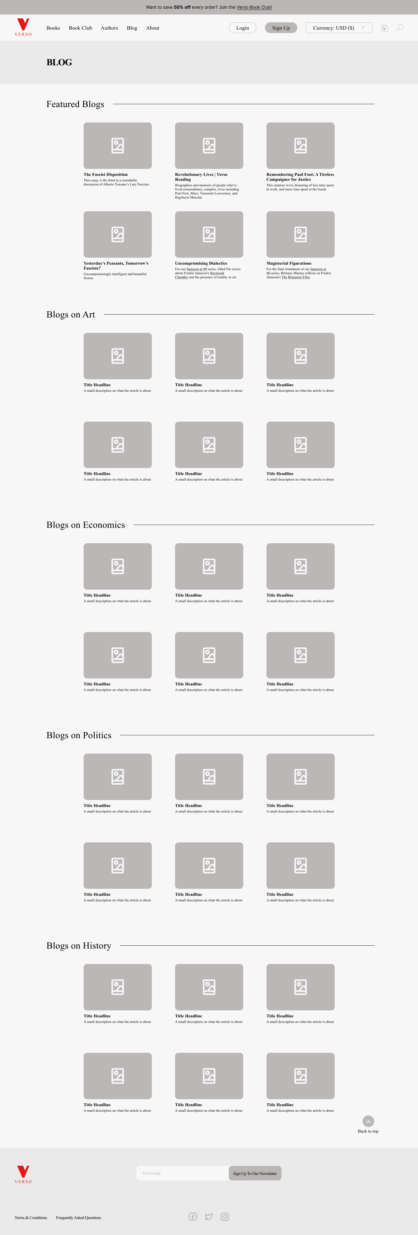
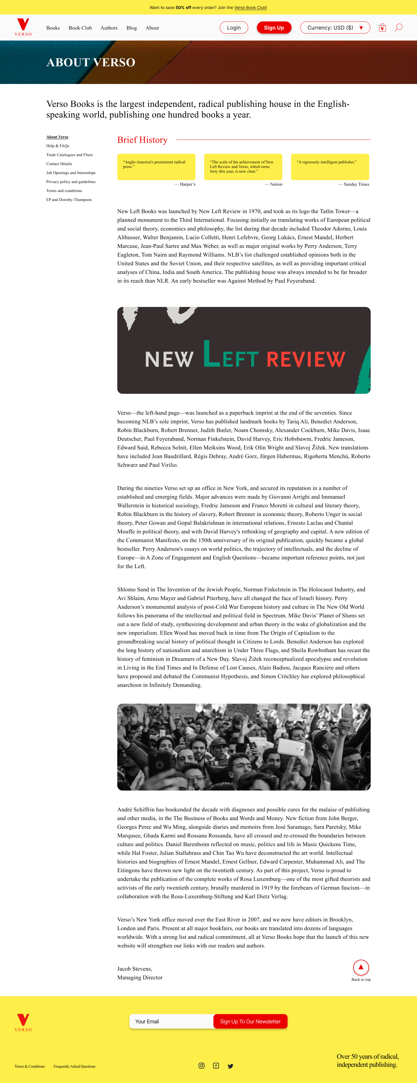
I also took the time to redesign the ‘blog’, ‘authors’, and ‘about’ pages, with more or less the same elements and concepts as the previously shown designs.
The Component Library
Closing Thoughts
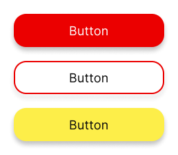
I learnt so much from this project and overall was such a fun little challenge to push myself and what I can do as a designer. If there is anything I would have done differently I would probably experiment more with the typography since I kept it simple and only had Times New Roman as the main text (and Inter for the buttons). I think Times New Roman was a great fit for an independent publishing house like Verso, but I believe I could have found a sleek font to complement the Times New Roman font. Overall, I was very fond of this project and the design journey from concept to completion deepened my understanding of user-centered design principles.
My Other Works
Bringing Movie Lovers Together
Expanding Letterboxd’s reputation by adding a forum feature and a chat DM feature.
Uncovering the Philippines’ Rich Culture
Designing an end-to-end travel app that specifically highlights the rich culture and attractions of the Philippines.
From Broken to a Working User-Friendly Website
Redesigning a small business’s website to be more efficient and bring in engagement from customers.


