Originails: From Broken to a User-Friendly Website
Designing a responsive website that will generate traffic.
Figma, Maze.co
Tools
Role
UX/UI Designer
Overview
Originails is a high-quality small business that provides a variety of nail services for the local community. However, their website is poorly designed and does not efficiently represent the business's brand. This project aims to design a responsive design for the business that perfectly encapsulates the business’ brand and utilizes their website more by booking online.
Problem
Originails’ website is not responsive or consistent which makes it hard for users to navigate through their websites. The quality of their website does not showcase the top quality of services they have as a small local business.
Solution
Create a responsive website that users and customers can rely on to read what kind of services Originails provides and be able to book them through their website without the hassle of having to call or go in-person.
Understanding the Users’ and the Business’s Needs
In order to identify the design problems of Originails, I had to dive into the business and their users. I applied 3 research methods; a User Interview, a Stakeholder Interview, and a Competitive Analysis. These research methods provided me with the essential background on their business and clarified their goals and expectations for the project.
User Interview Main Takeaways
The first thing I asked participants was to use 5 words to describe what Originails meant to them. From the get-go, participants would paint the picture on the business and would help me define what elements to prioritise later in the design process.
A Word Cloud of what participants would describe Originails:
Other Key Takeaways:
Preferred Form of Communication
Most of the participants preferred to book appointments online or through social media since it is just within the tip of their fingers. However, because they are fond of getting their nails done, they usually conform to the methods preferred by nail salons.
Key Information Users Look For
Participants listed a number of things they thought were important to see on a nail salon’s website, such as the type of services offered, prices, location, a gallery, testimonies, contact info, and a booking system.
Competitive Analysis
Pink Parlour
Pros
They stand out because of their branding. Their business is very pink focused which makes it easy for customers to notice and feel intrigued. It has a very feminine look to them.
Cons
Customers cannot book on the website itself, there are only instructions on how to do so, which is basically going to their Facebook page.
Nail-a-holics
Pros
You can book on their website for an appointment, which is not as common.
Cons
The fill-in form to book an appointment is a bit hard to view because of the opacity and the background image.
Olisitica
Pros
They have a blogs section to educate their customers on the benefits of getting massages or different nail services.
Cons
Customers can’t actually book on their website, instead when customers click “book now” they are only shown the menu.
Originails
Pros
They promote and cater to both women and men, which is something the other businesses lack in.
Cons
The website’s UI is cluttered, disorganised, and there is no CTA.
Stakeholder Interview
To understand more of what Originails wanted and how they viewed their own company, I interviewed the client. This was especially important as it would help me identify their strengths and weaknesses and if they were communicating their goals to their customers efficiently.
Key Takeaways:
Originails is a small local family-owned business that was founded back in 2017. They provide different nail services with the utmost quality.
Originails takes pride in bringing top-quality nails to their customers. They prioritise hygiene and satisfaction and describe the overall tone of their business as chic and classy.
The client wants a functional website where customers can seamlessly book appointments without the trouble of having to go in person or having to call. They also believe it lifts some of the burden off the staff by keeping appointments organised.
“A website is a perfect window for users to view the quality of a business. It could make or break your reputation.”
Designing To Meet the Business’s and Users’ Needs
How was I going to design a website that would reflect the business’s brand? And that would generate traffic?
Landing Page
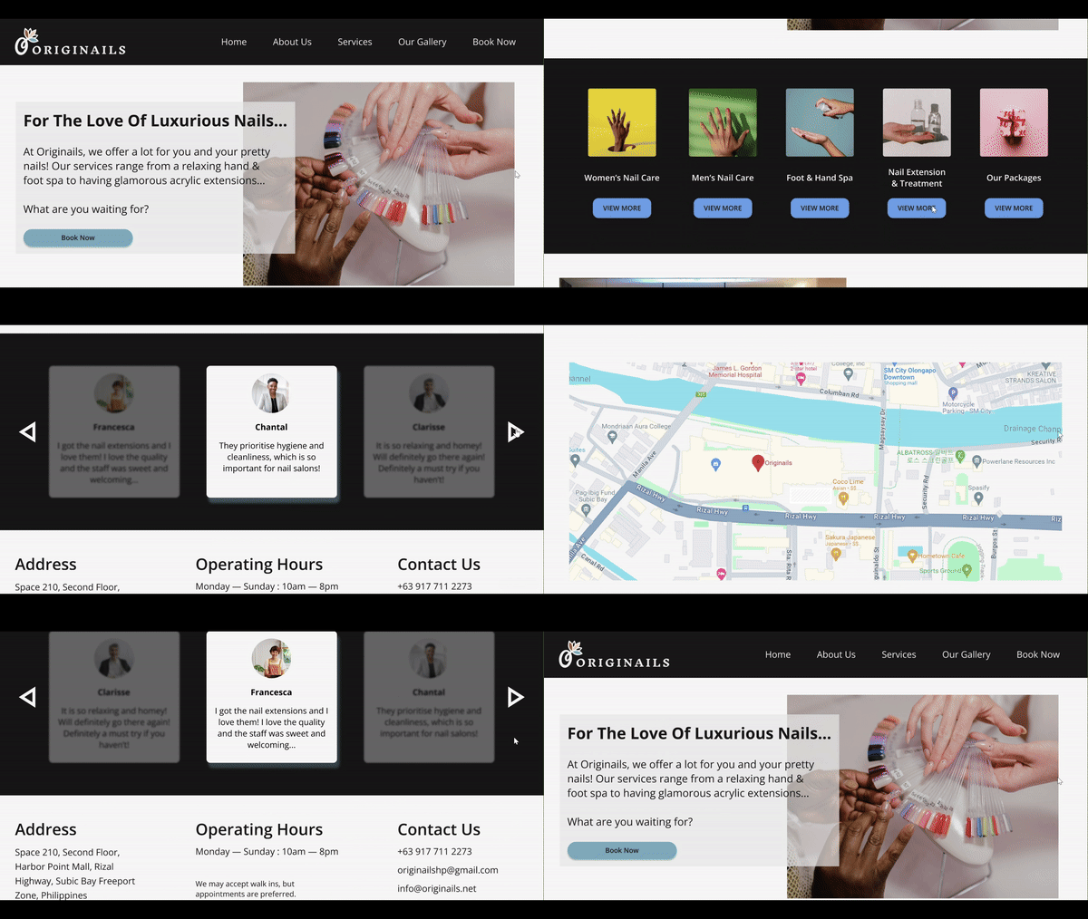
I designed a landing page that had a clear navigation bar and CTA. I made sure to section their services into different categories so it would make it easier for the user to pick out which type of service they would like. I also added a section that would give a short description of what the business is about and the testimonies. Lastly, since it was important for the users to know and quickly spot this information, I added the location in the form of a map, the opening hours and the contact information. I made sure to keep it simple but efficient.
Booking Calendar
In order to bring in engagement and traffic, I needed to create a functional feature that was convenient for both the customers and the business. I added a booking feature to their website, allowing customers to book an appointment. This feature is efficient because it streamlines the booking system and improves the customer and user experience. Furthermore, it also allows the business to collect data on their customers, what services are popular, and when they are the busiest. Overall, it fits perfectly with the business and conveys professionalism, which is the main goal of this project.
Service Menu
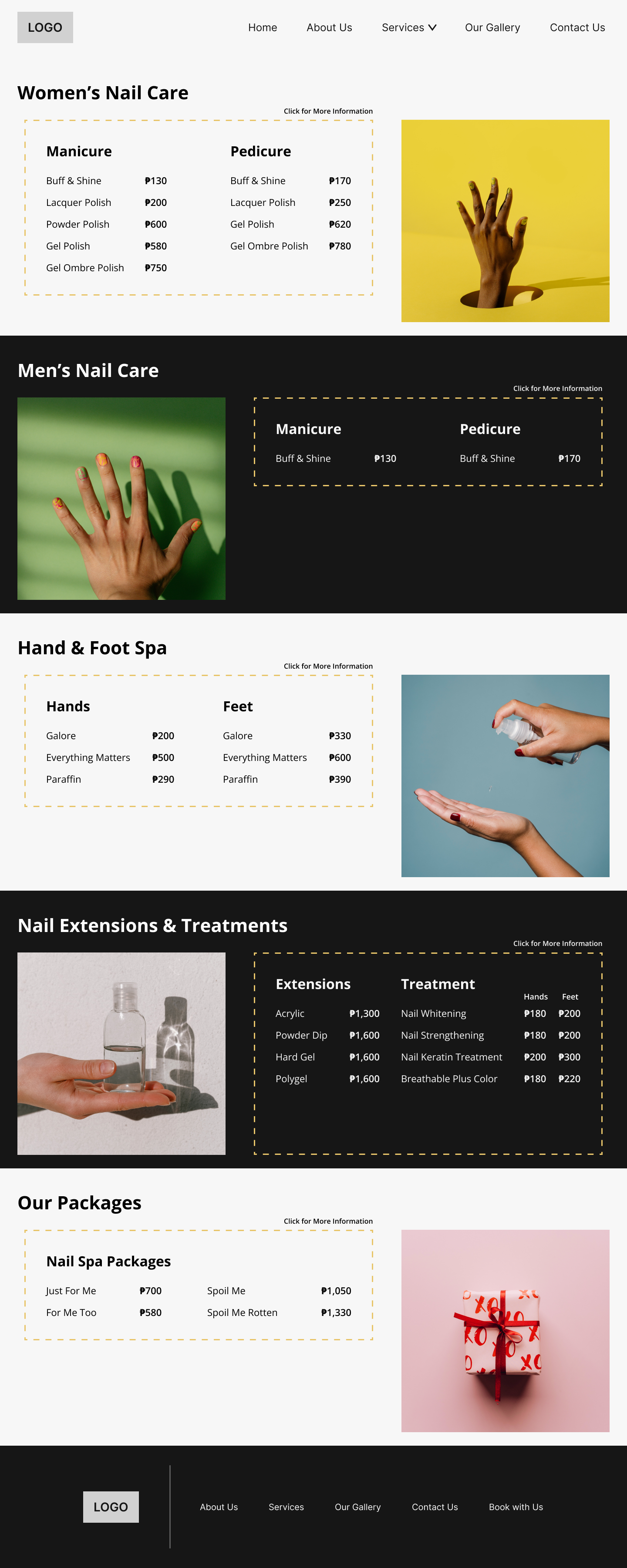
It was important to show what services Originails offered, which is one of the main features to have on the website.
‘Detailed Service’ Screen To A ‘Gallery’ Screen
Initially, I wanted the service menu to be interactive where the user would click on each individual service to see a detailed description and gallery of the service on the next page. However, when testing this design, the participants thought there was a bit of cognitive friction, as it required users to go through a frustrating process of clicking each service to just look for the description and then clicking again to go back to the full service menu. Later on we will see how I solved the problem of the service menu and the descriptions, but for now, I changed the ‘detailed service’ screen to a ‘gallery’ screen.
Before: ‘Detailed Service’
After: ‘Gallery’
About Us
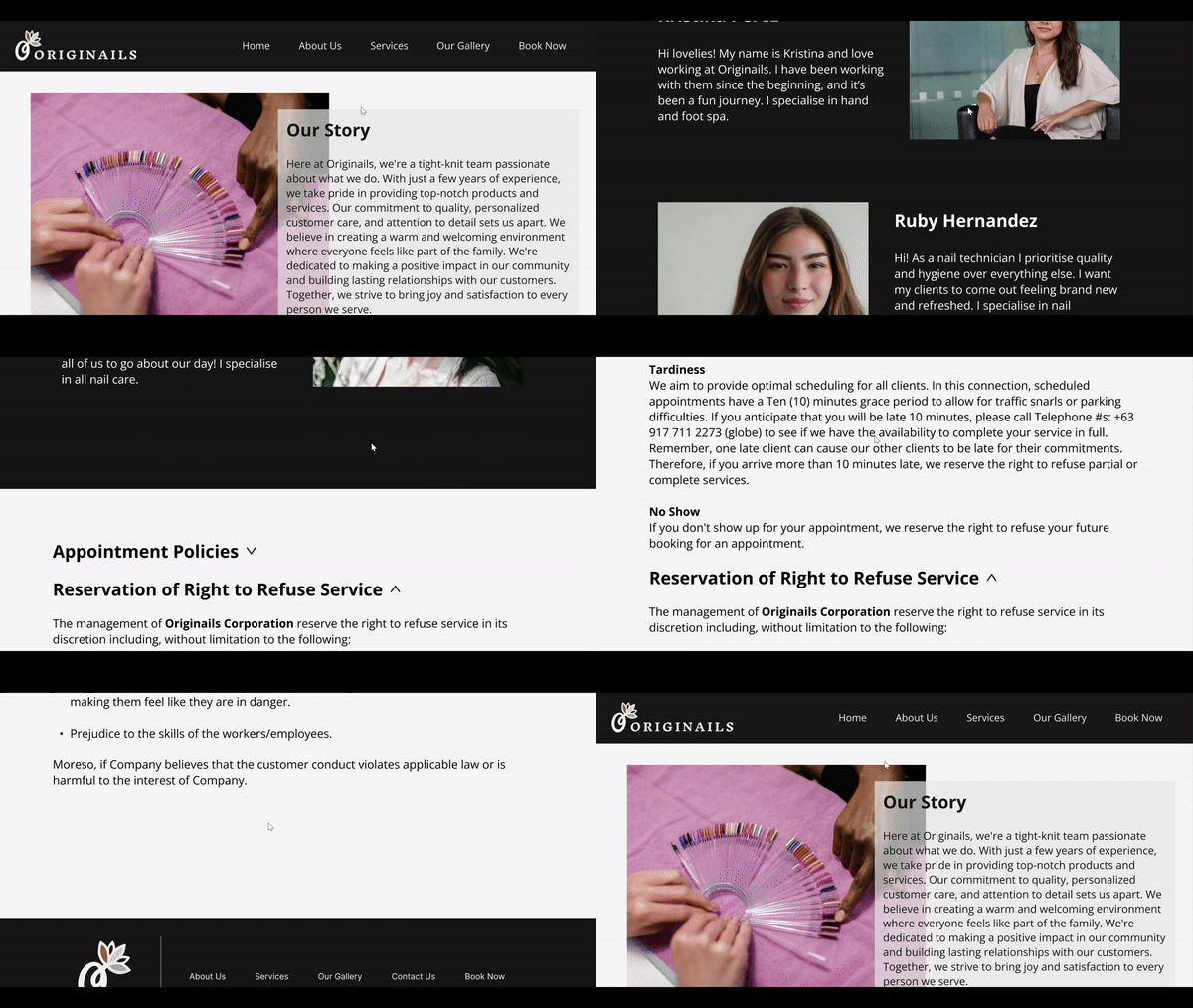
Lastly, I added an About Us page, allowing users to know more about the business, and also adding other important information such as their appointment policies. Initially, I wanted the design of the ‘Our Team’ section to be in a carousel. However, I noticed that the appointment policies took up a lot of space on the page and instead, the page was wordy instead of inviting. So I made the ‘Our Team’ section appear all on the page since it was a small business and therefore a small team and applied a collapse/expand UI to the policies making it more visually pleasing.
Before
After
Testing the Design
Research Goals
Evaluate whether the overall user experience is smooth and efficient for the users to navigate around
Identify any pain points and challenges users may face
Assess the user’s ability to navigate through the ‘Landing’ screen (‘Landing’ Task Flow)
Assess the user’s ability to book an appointment through the calendar (‘Booking Calendar’ Task Flow)
Assess the user’s ability to navigate through the service menu (‘Service Menu’ Task Flow)
Assess the user’s ability to navigate through the ‘About Us’ page (‘About Us’ Task Flow)
Assess the user’s ability to navigate through the 'Gallery’ page (‘Gallery’ Task Flow)
Main Iteration: The Service Menu & Description
When designing the mid-fidelity wireframes, I initially had each service have its own detailed overview screen. However, the participants did not like the extra step of clicking each service just to see the description.
My first solution was creating a hover interaction, where the user would just have to hover each service to view the description of the service. When testing the product, this interaction was received with a lot of positive feedback and the participants only had issues with the UI of the card. However, when testing the product with other UX/UI designers, this feature was met with criticisms, stating that this was not a common feature at all, leading me to disregard this design feature.
Before
After
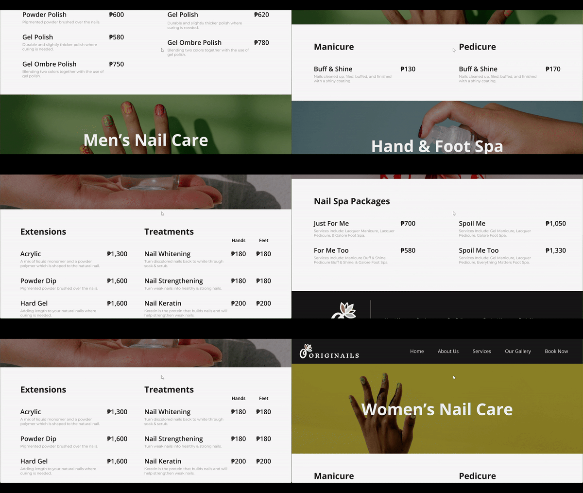
For my final solution, I redesigned the whole service menu screen and added the description to be under each service, making sure it didn’t look cluttered and overwhelming for the user. This allowed users to view the full service menu with the descriptions on the same page.
Final Design
Landing
The landing page introduces Originails and what they do, along with a CTA, service menu categories, testimonies, location, operating hours, and contact details.
Booking
The next feature users can use on the website is booking an appointment. This feature improves the customer and user experience of Originails. This page includes an interactive calendar with the available booking times, along with a customer detail form and appointment policies. Once you review your booking, the page will take you to the next page where you review and confirm your booking.
About
Users can learn more about Originails by navigating to the ‘About Us’ page. This page consists of a short description of Originails, an ‘Our Team’ section and the appointment policies.
Service Menu
Originails offers a variety of services and users can view them under ‘Services’. There are 5 sections to their menu, so the services are divided into their respective category.
Gallery
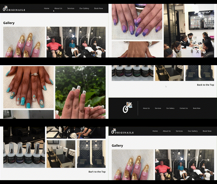
Lastly, users can view pictures of the customers and services offered under the ‘Gallery’ page.
Responsive Prototype
Closing Thoughts
For this project, it was my first time working with a client, and taught me how to meet the client’s expectations while also considering the user experience. If there is anything I would do differently, I would have found more inspiration and examples online to help me make the UI components and interactions needed for my prototyping. However, even though it was challenging, I learned a lot from creating those components, and it gave me a chance to experiment and grow as a designer.
My Other Works
A Journey of Functionality and Visual Design
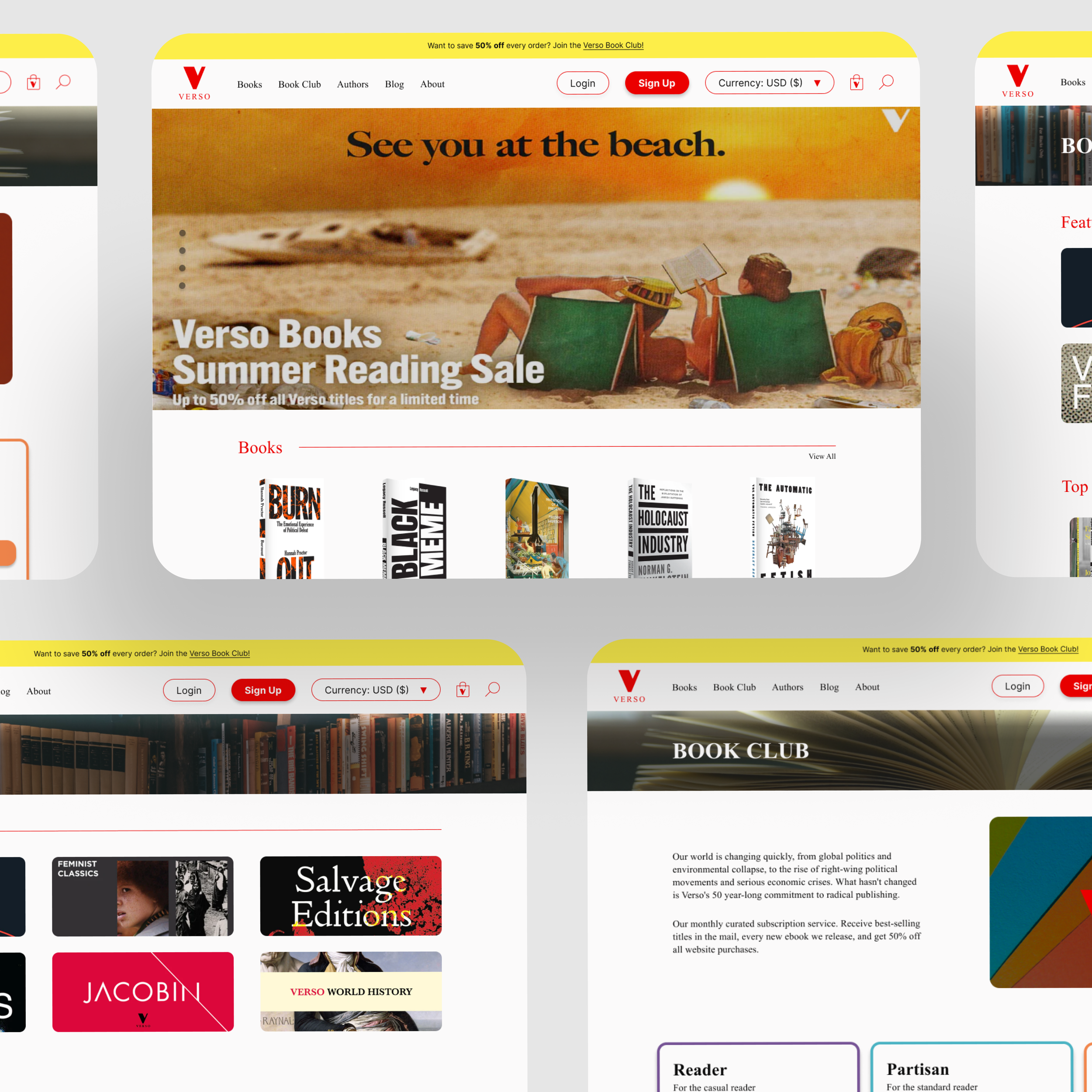
Redesigning Verso Books’ website to be more user-friendly and functional.
Bringing Movie Lovers Together
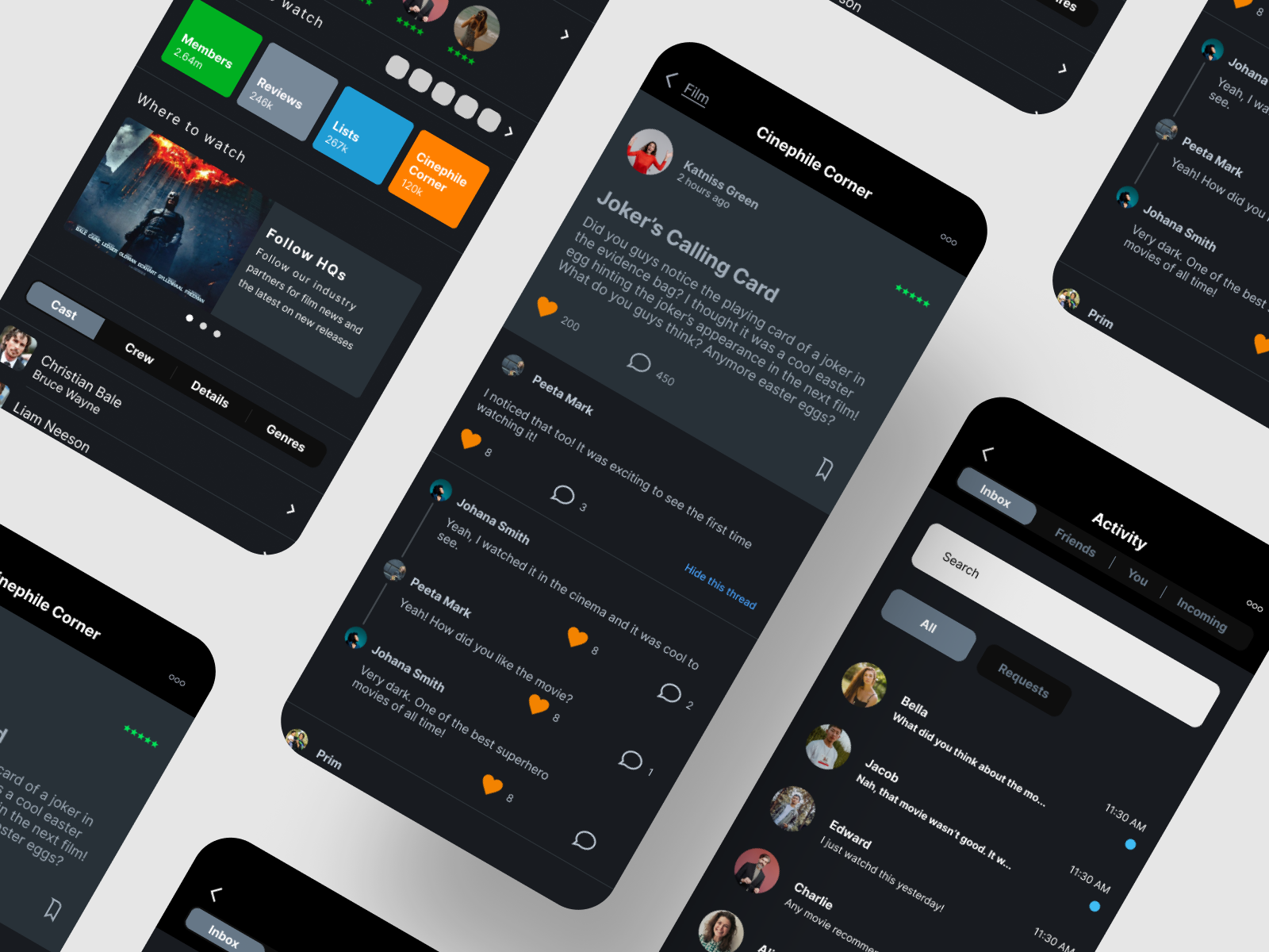
Expanding Letterboxd’s reputation by adding a forum feature and a chat DM feature.
Uncovering the Philippines’ Rich Culture
Designing an end-to-end travel app that specifically highlights the rich culture and attractions of the Philippines.
